
How to Optimize Your Landing Pages for Maximum Conversions
Introduction: Building an Unshakeable Foundation for Conversion
In the silent, split-second dialogue between a user and your screen, perception isn’t just part of the conversation—it’s the entire language. User psychology doesn’t just shape the journey; it dictates the destination.
Picture the scene: a meticulously crafted ad campaign, fueled by brilliant creative and a perfectly segmented audience. The clicks pour in—a torrent of targeted traffic surges to your site. The analytics glow. But then… silence. The conversion column remains stubbornly at zero. That torrent of potential revenue vanishes into a digital abyss, and the question echoes in the void: “Where did it all go wrong?”
The answer, almost always, lies not in the invitation but in the reception. The failure isn’t in your traffic; it’s on your digital doorstep. Your landing page. This is the final, decisive battleground where interest either blossoms into action or withers from friction.
Think of it this way: You’ve invited esteemed guests to a palace (your brand), showcasing its magnificent facade (your ads), but the drawbridge is broken, the halls are confusing, and the throne room is hidden (a poor UX/UI). The foundation of their experience—the trust, clarity, and ease of their journey—is shaky. When that foundation crumbles, everything built upon it, no matter how beautiful, falls with it.
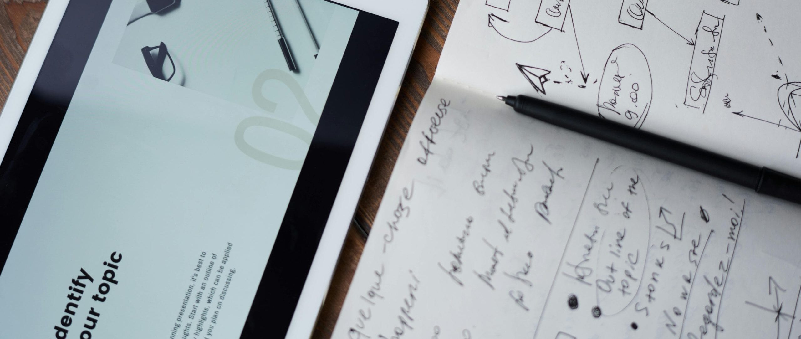
This is not just another checklist. This is a deep dive into the architecture of persuasion. We will move beyond the ‘what’ and into the ‘why,’ decoding the principles of User Experience (UX) and Conversion Rate Optimization (CRO) that turn casual clicks into committed action. You’ll learn that it’s not about random tweaks, but precise, strategic interventionsthat build a foundation of trust and guide the user, step by step, to the inevitable ‘yes.’
Ready to build something that lasts?

Clear, compelling value proposition
The value proposition on your landing page is your business's promise. It's the foundation that tells visitors what sets you apart and why they should choose you over competitors.
Strong & Visible CTA
Your CTA is the main event—it’s what drives visitors to take action. But a poorly designed or unclear CTA can easily lose you conversions. Think of your CTA as the “door” to conversion—visitors need to know where to go, and it must be an inviting and obvious path.
Minimalist, Distraction-free Layout
In web design, less is often more. A cluttered landing page can confuse visitors, leading them to bounce instead of converting. Simplicity improves navigation, allows your key message to stand out, and creates a more focused user experience.
Social proof (testimonials, case studies etc.)
Trust is everything when it comes to conversion. Social proof—such as testimonials, case studies, or client logos—serves as third-party validation and helps eliminate doubt in the minds of potential customers.
Fast Load Time (Under 3 sec.)
No matter how compelling your landing page is, if it takes too long to load, your visitors will leave before they even see it. Page load time directly affects both user experience and your SEO rankings.
A/B Testing Ongoing
No landing page is ever perfect, and that’s why A/B testing is crucial. A/B testing allows you to experiment with different versions of your landing page to see which one performs better. From button colors to headline changes, continuous testing helps you refine and optimize over time.
Mobile Friendly Design
With more than half of web traffic coming from mobile devices, a mobile-optimized landing page is crucial. If your page is difficult to navigate on a smartphone or tablet, users will abandon it.
Key Point 1: Crafting a Clear, Compelling Value Proposition
The value proposition on your landing page is your business's promise and first touch with your audience. It's the foundation that tells visitors what sets you apart and why they should choose you over competitors.
Why It Matters
Visitors need to understand what you offer and why it benefits them within seconds. Research shows that you have about 50 milliseconds to make an impression. This is why the value proposition must be immediately clear, simple, and actionable.
Example:
I once worked with a small e-commerce business that struggled to communicate its unique selling points. Their headline read: “Welcome to ABC Products.” It was generic and failed to differentiate them. After some audience research, we changed the headline to focus on their core strength: “Handcrafted, Organic Skincare for Radiant, Healthy Skin.”
The result? A 25% increase in conversions.
Key Point 2: Optimize Your Call-to-Action (CTA)
Your CTA is the main event—it’s what drives visitors to take action. But a poorly designed or unclear CTA can easily lose you conversions. Think of your CTA as the “door” to conversion—visitors need to know where to go, and it must be an inviting and obvious path.
Best Practices for CTA Optimization:
Clarity Above All: Avoid vague language like “Submit” or “Click Here.” Use action-oriented phrases such as “Start Your Free Trial” or “Download the Guide.”
Visibility: The CTA button should be prominently placed, easy to see, and ideally above the fold (the first part of the page visible without scrolling). Use contrasting colors to make it pop.
Create a Sense of Urgency: Adding phrases like “Limited Time Offer” or “Get Started Today” can encourage users to act quickly.
A/B Test Your CTA: Sometimes, even the smallest tweak—like changing “Get My Free Ebook” to “Claim Your Free Ebook”—can increase clicks. A/B testing different versions allows you to optimize based on actual user behavior.
A local SaaS company I worked with saw a 30% lift in conversions by simply changing their CTA from “Sign Up” to “Get Your Free Demo.” It was a clearer, more compelling action.
The result? 30% lift in conversions.
Key Point 3: Simplify Your Landing Page Layout
In web design, less is often more. A cluttered landing page can confuse visitors, leading them to bounce instead of converting. Simplicity improves navigation, allows your key message to stand out, and creates a more focused user experience.
Elements of an Effective Layout:
Minimal Distractions: Every element on your landing page should support the goal of conversion. And should be leading your customer to do what you want them to do.! (buying something, signing up for something etc.) Remove unnecessary links, navigation bars, and large text blocks that pull attention away from your CTA.
Whitespace is Your Friend: Don’t be afraid of empty space—it draws attention to your most important content.
Visual Hierarchy: Guide the visitor’s eye with strategic placement of elements. Important information (value proposition, CTA) should be above the fold and immediately noticeable.
Use Visuals Wisely: A relevant, high-quality image or video can enhance your message. Avoid stock photos that don’t feel authentic.
Case Study:
A B2B software company improved their conversions by decluttering their landing page, reducing the number of form fields, and using large, engaging product images.
The result was a 40% boost in lead submissions.
Key Point 4: Build Trust with Social Proof
Trust is everything when it comes to conversion. Social proof—such as testimonials, case studies, or client logos—serves as third-party validation and helps eliminate doubt in the minds of potential customers.
Types of Social Proof to Consider:
Customer Testimonials: Highlight quotes from satisfied clients that speak directly to your product's benefits.
Case Studies: If applicable, share case studies that show the real-world impact your product or service has had.
Trust Badges: Security badges, money-back guarantees, and certifications can further increase trust.
Client Logos: If you’ve worked with recognizable brands, include their logos. Familiarity breeds trust.
Example:
An e-learning platform I worked with displayed logos from reputable universities they collaborated with. Even with this simple addition increased their credibility and resulted in a 15% uplift in conversions.
Key Point 5: Speed Up Your Page Load Time
No matter how compelling your landing page is, if it takes too long to load, your visitors will leave before they even see it. Page load time directly affects both user experience and your SEO rankings. You should be aware of the time is 2024 and 2025 soon and humanity has lost their attention day by day, year by year... So, in this situation you are in a rabbit race and you have maybe a little more than a second. Hey! this second is not for the beating your competitors but to stay still!
Tips to Boost Speed:
Compress Images: Large image files slow down load times. Use formats like JPEG and compress images to reduce their size. And you may try to optimize before you upload your website and after uploading it. And please use WEBP!
Reduce Redirects: Each redirect adds to the page load time. Keep them to a minimum.
Enable Browser Caching: Allow returning visitors to load your page faster by storing some data on their device.
Use a Content Delivery Network (CDN): Distribute content across multiple servers to reduce load time for users based on their location.
Example:
After optimizing image sizes and reducing unnecessary plugins, a local retailer’s landing page load time dropped from 7 seconds to 2.5 seconds.
This change led to a 20% decrease in bounce rate and a 15% increase in conversions.
Key Point 6: Leverage A/B Testing for Continuous Improvement
We are all human!
I always wonder what could be the best scenario... Let me explain, for example, I'm running ads with 800 ROAS, OMG ha ? Should be. But even before having a celebration diner with this score, for me first question is always why it's not 1800 while I can hit the 800. What creatives could bring me more profit or what audience could be more profitable... So, good to have A/B tests...
No landing page is ever perfect, and that’s why A/B testing is crucial. A/B testing allows you to experiment with different versions of your landing page to see which one performs better. From button colors to headline changes, continuous testing helps you refine and optimize over time.
What to Test:
- Headline variations
- Different CTAs
- Color schemes
- Layout changes
- Testimonials vs. no testimonials
Key Point 7: Mobile Optimization is Non-Negotiable
With more than half of web traffic coming from mobile devices, a mobile-optimized landing page is crucial. If your page is difficult to navigate on a smartphone or tablet, users will abandon it.
Mobile Optimization Best Practices:
Responsive Design: Ensure that your landing page automatically adjusts to fit any screen size.
Touch-Friendly Buttons: Make sure buttons and links are large enough to be tapped on mobile devices.
Simplified Forms: Minimize the number of fields in mobile forms to avoid frustration.
So, Continuous Optimization for Maximum Results
Optimizing your landing pages for conversions is an ongoing process.
Each tweak, A/B test, and insight brings you closer to higher conversion rates and better ROI. Remember, even small changes like adjusting your CTA language or decluttering your layout can lead to significant improvements.
Treat your landing page like an evolving asset, constantly refining and optimizing to keep up with user behavior and market trends. By focusing on CRO, UX, and staying customer-centric, you’ll build a digital foundation that turns visitors into loyal, long-term customers.
Yo can contact with us by clicking here to examine on your web site or create a project for your conversion optimization!.
Written by Burak Arda Özgül
With over 7+ years of work experience, I have a wealth of knowledge and expertise in developing and implementing successful marketing, social media and content strategies to help my teams and operations thrive. From SEO/SEM to content creation and social media management, I have the technical skills and strategic mindset to increase online engagement, lead generation and brand awareness. I am someone to work with to achieve your corporate goals focused on performance and efficiency.


Leave a comment: